 Flutter Kanpur
When you start working on a frontend project, things usually feel pretty simple.
You build a component, add some spacing, choose a border radius, make it responsive, and move on to the next one.
But as the project grows, you start noticing something.
One component has 16px padding, another has 20px. One card has a 12px border radius, another has 10px. A breakpoint that works perfectly on one page feels slightly off on another.
Individually, these differences don't seem like a big deal. But when you have dozens of components and pages, they start adding up.
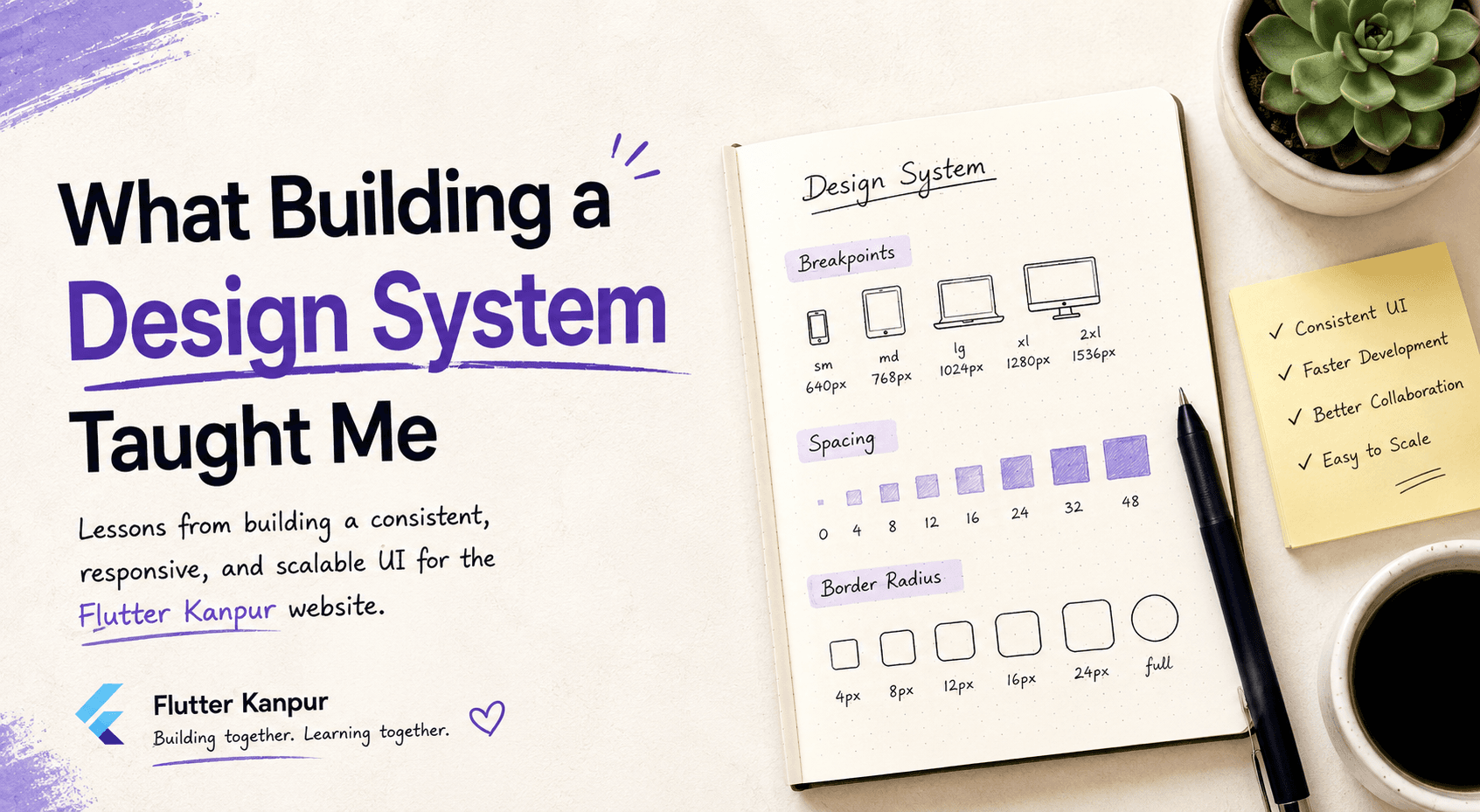
This is something I started noticing while working on the Flutter Kanpur website. It made me realize that a good frontend isn't just about building components. It's also about having a system behind those components.
That's where a Design System comes in.
A design system gives the team a common set of rules and reusable values to work with. Instead of everyone making their own decisions for spacing, responsiveness, or styling, we can rely on the same set of utilities throughout the project.
While working on the Flutter Kanpur website, I got the opportunity to work on three parts of our design system: Breakpoints, Spacing, and Border Radius.
Breakpoints: Making Responsiveness Consistent
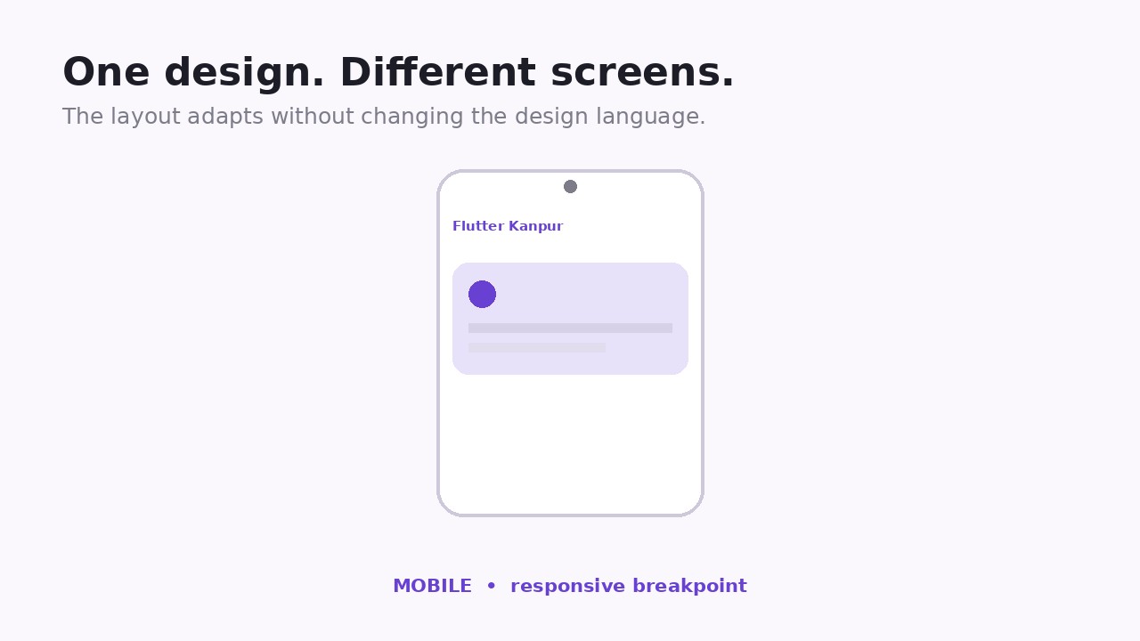
Responsive design can get messy pretty quickly.
When every component has its own media queries and everyone uses slightly different screen sizes as breakpoints, maintaining the UI becomes harder than it needs to be.
So instead of defining breakpoints whenever we need them, we created a centralized set of breakpoints that can be used across the project.
Now, when building a component, there's no need to think:
"Should I use this screen size here or the one I used on the previous page?"
There's already a common system to follow.
It might seem like a small thing, but having these decisions made upfront makes responsive development much more predictable.
Spacing: More Than Just Margins and Padding
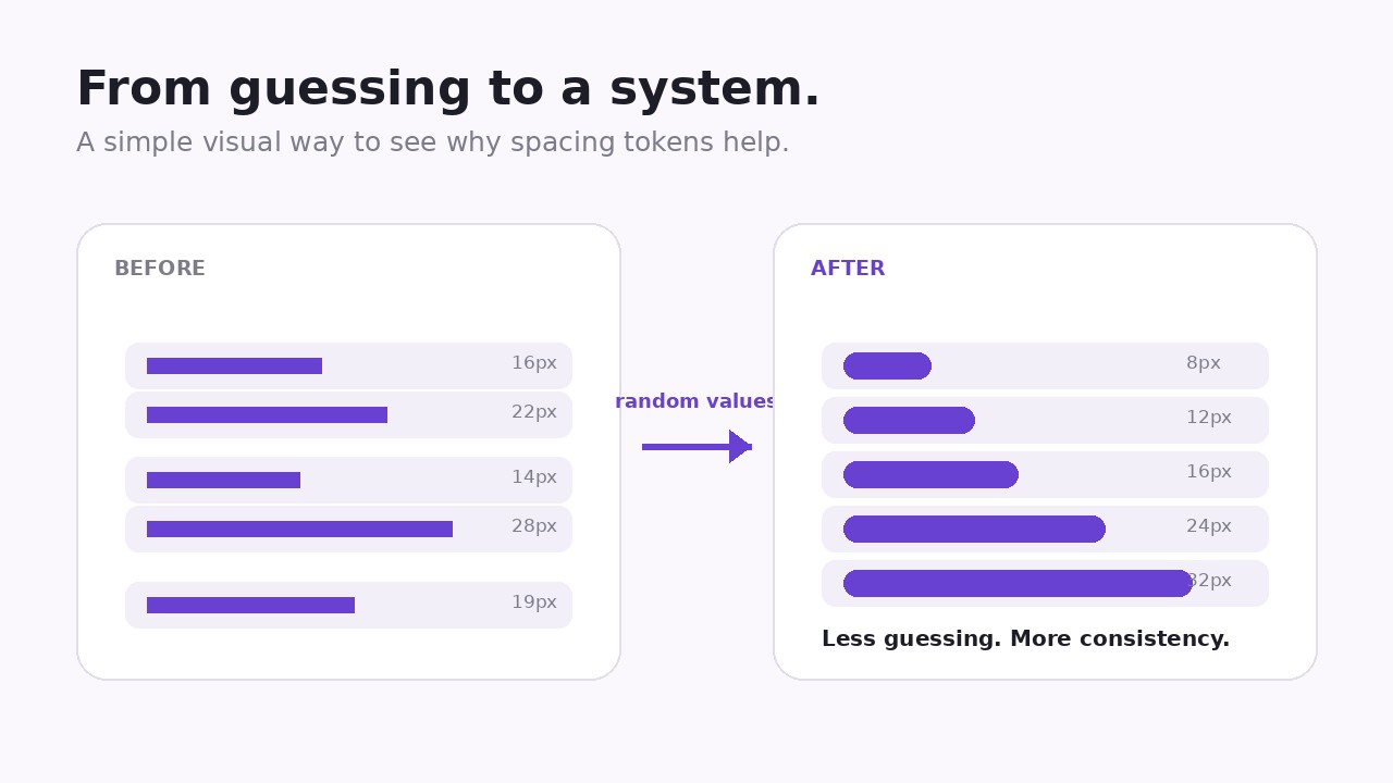
Spacing was another thing that made me realize how quickly small inconsistencies can creep into a project.
When you're building a component, it's easy to just write something like padding: 18px because it looks right at that moment.
Then another component needs spacing and you use 20px. Somewhere else it's 24px.
Nothing is technically broken, but the UI slowly starts losing its visual rhythm.
Having a predefined spacing scale helps solve this.
Instead of randomly choosing values, we have a set of spacing values that can be reused throughout the application.
The biggest benefit for me wasn't just consistency. It also made styling decisions faster.
I don't have to keep deciding what spacing value to use every time I build something. I can simply pick from the existing system.
Border Radius: A Small Detail I Started Paying More Attention To
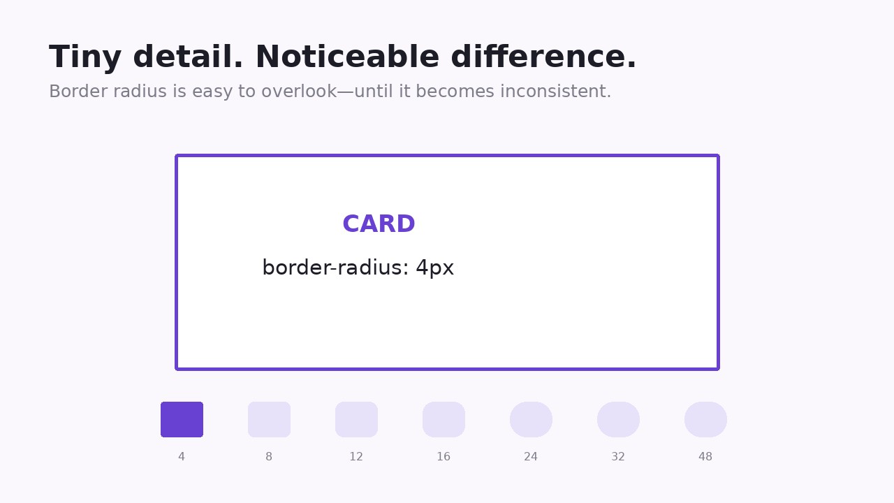
Border radius sounds like a very small thing.
And honestly, before working on a design system, I probably wouldn't have thought much about it.
But once you start looking at an interface as a whole, you notice how much these small details affect the overall feel of the product.
If one card has rounded corners, another has slightly sharper corners, and buttons use a completely different radius, the UI can start feeling inconsistent.
So we created reusable border radius values that can be used across cards, buttons, inputs, and other components.
Again, it's a small decision.
But when hundreds of small decisions follow the same rule, the entire interface feels much more intentional.
So, Why Does a Design System Actually Matter?
For me, the biggest value of a design system isn't that it makes the code look cleaner.
It's that it removes unnecessary decisions.
Instead of repeatedly asking:
Which spacing should I use?
Which breakpoint should this component follow?
What border radius should this card have?
There's already an answer.
That makes development faster and also makes it easier for multiple developers to work on the same project without the UI slowly drifting in different directions.
A design system also makes future changes easier. If we decide to change our spacing scale or adjust a breakpoint, we can make that change at the system level rather than hunting through individual components.
What I Took Away From This
One thing I learned while working on these utilities is that frontend development isn't only about making a component look good.
It's also about thinking about what happens when that component is used 10, 20, or 100 times across a project.
A small decision that seems unnecessary when you're building one component can become extremely valuable when the application starts growing.
Users probably won't look at a button and think, "Nice, they used a consistent border-radius token here."
And that's actually the point.
They don't need to notice the system.
They just need the interface to feel consistent, predictable, and polished.
That's what a good design system helps achieve.
Great interfaces are built component by component, but keeping those components consistent is what turns them into a product.